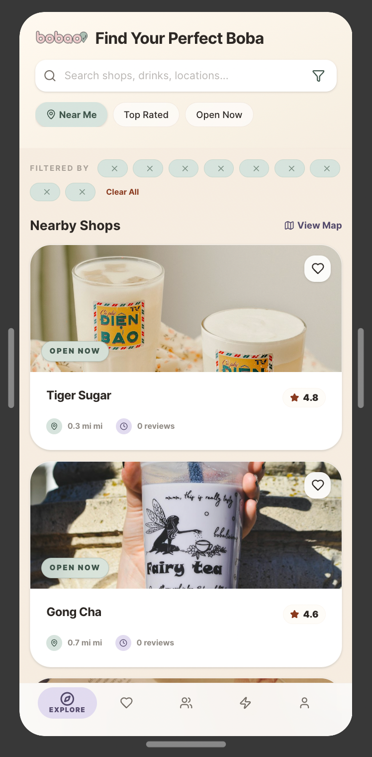
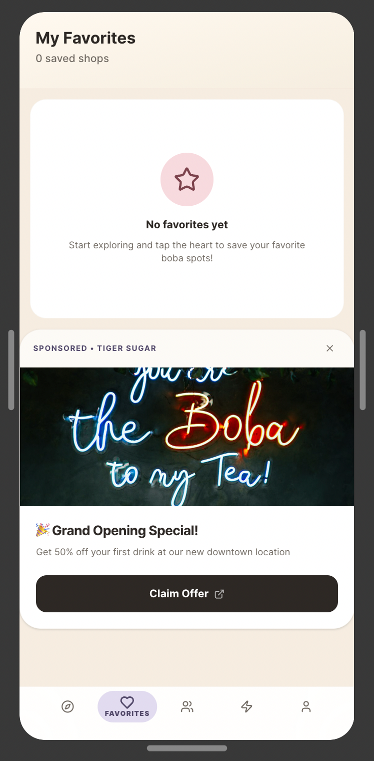
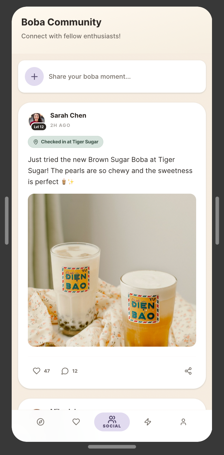
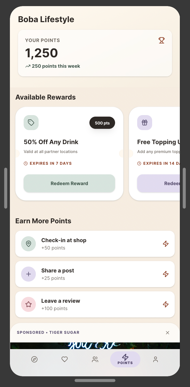
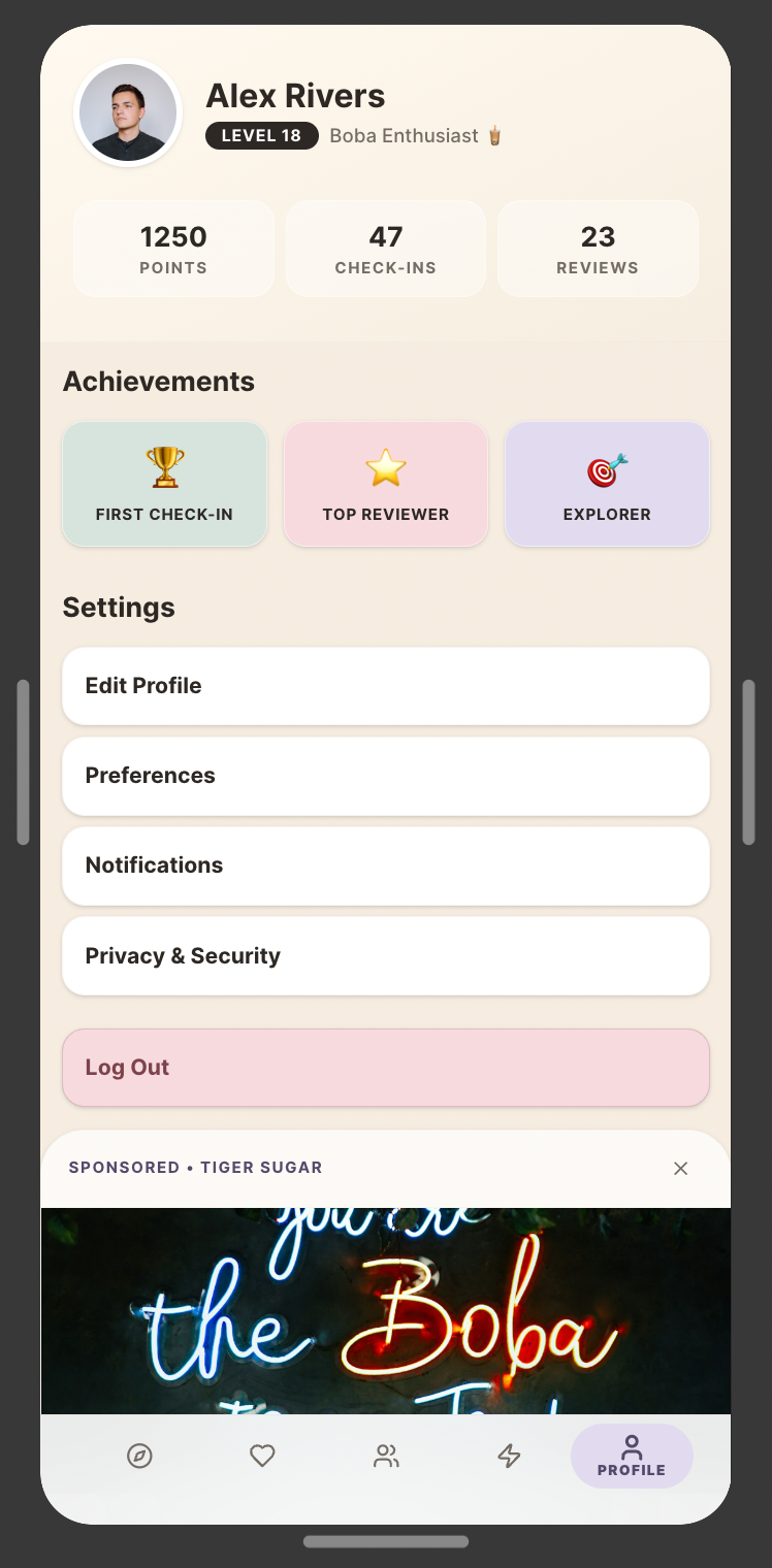
Focus: Product Strategy, UI/UX, & Visual Delight.
The Challenge: The "social beverage" space is crowded, yet the user experience remains fragmented. Finding boba shops with specific dietary options (like dairy-free alternatives or precise sweetness levels) is often a chore, and sharing those niche discoveries with friends is even harder. The challenge for bobao was to design a mobile experience that didn't just list shops, but built a community around the "boba lifestyle" while remaining intuitive and rewarding to use.
My Role: As the Lead Product Designer, I conducted user research to identify friction points in existing food-discovery apps. I built the design system from the ground up—including custom iconography and a playful yet functional UI. I was responsible for the end-to-end product strategy, translating community-driven features into a high-fidelity prototype.
The Result: A community-driven mobile app that streamlines the tea-discovery process while allowing users to 'clink' (connect) with friends over their favorite brews. By combining a robust filtering system for tea enthusiasts with social sharing features, I designed an environment that feels as refreshing as the product it promotes. The final prototype successfully balances social connectivity with utility, utilizing "micro-interactions" to drive user engagement.
Tools & Skills: * Strategy: UX Research, Product Strategy, User Personas
Design: Wireframing, Figma, Design Systems
Prototyping: Interactive Prototyping, Micro-interactions
The Linguistic "Easter Eggs"
In Mandarin, Bao (宝/寶) means treasure, baby, or precious.
Bo + Bao literally sounds like "Boba Treasure."
It also plays on Bao (包), like a steamed bun or a "package/bag." It gives the name a soft, squishy, "comfy" feeling that you get when drinking and chewing on boba.
1. Typography & Logotype
The Vibe: The rounded, heavy sans-serif feels "squishy" and soft—much like a tapioca pearl. Using lowercase letters across the board makes the brand feel friendly and accessible rather than corporate.
Visual Weight: The thick dark-grey stroke provides a strong container for the pastel colors, ensuring the logo pops against various backgrounds (important for social media avatars).
2. Iconography: The Pin-Bubble
Double Meaning: It functions as both a map pin (suggesting a destination or "the place to be") and a speech bubble/sparkle.
The Sparkle: Adding the star and the curved "shine" lines gives it a "fresh" or "magical" quality. It moves the brand from just a drink shop to a lifestyle "find."
3. Color Palette Analysis
Milk Tea Chic: It’s sophisticated and muted rather than neon or sugary.
Milk Tea Chic: It’s sophisticated and muted rather than neon or sugary.
The Pink & Green: This is a classic "Strawberry/Matcha" pairing. It’s high-contrast in hue but low-contrast in saturation, which makes it easy on the eyes.
The Neutrals: Adding the cream, tan, and expresso anchors the pastels. The tan color specifically evokes the look of brown sugar boba or milk tea, which helps subconsciously communicate what the product is.
4. Brand Versatility
Social Readiness: The full "bobao" wordmark is great for storefronts or menus, but the "bb" icon is essential for Instagram profile pictures, stickers, or the bottom of a plastic cup where space is limited.
Consistency: The icon maintains the same stroke weight and "pin" element, keeping the identity cohesive.
